
Interior design is an art form that combines creativity, aesthetics, and functionality to transform spaces into inviting and harmonious environments. One of the fundamental aspects of interior design is the coordination of colors and patterns. When colors and patterns do not complement each other, it can lead to a dissonant and chaotic atmosphere, detracting from the overall appeal of the space. This article delves into the common errors that occur when there is a lack of harmony between colors and patterns in interior design.
The Significance of Color and Pattern Coordination:
Color and pattern coordination is essential in interior design because it greatly influences the mood, atmosphere, and visual appeal of a space. When done correctly, it can create a sense of balance, unity, and cohesiveness that makes a room feel comfortable and inviting. However, when this coordination is neglected, the results can be quite the opposite.
Common Errors in Color and Pattern Coordination:
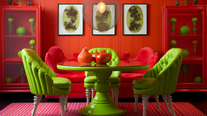
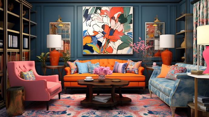
Clashing Colors: One of the most common mistakes in interior design is using colors that clash with each other. Clashing colors create visual discomfort and can be overwhelming. For example, pairing bright red with neon green may be visually jarring and create a sense of chaos in a room.
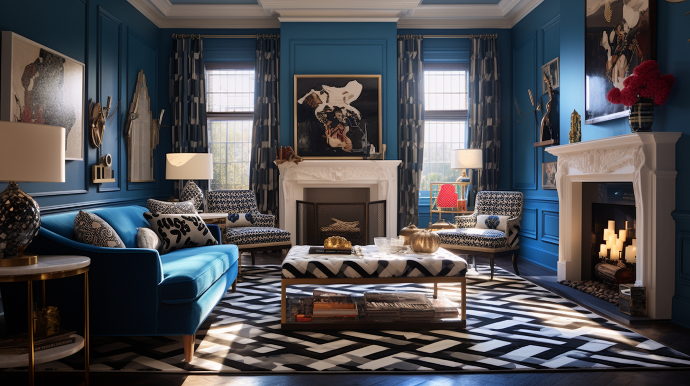
Pattern Overload:
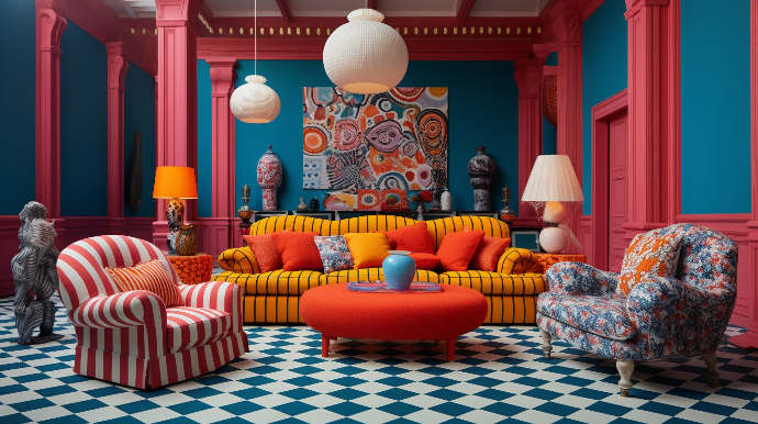
Another error is an overabundance of patterns. Mixing too many patterns in a single space can make it look busy and chaotic. It's important to strike a balance between solid colors and patterns to avoid overwhelming the senses.
Ignoring the Color Wheel:

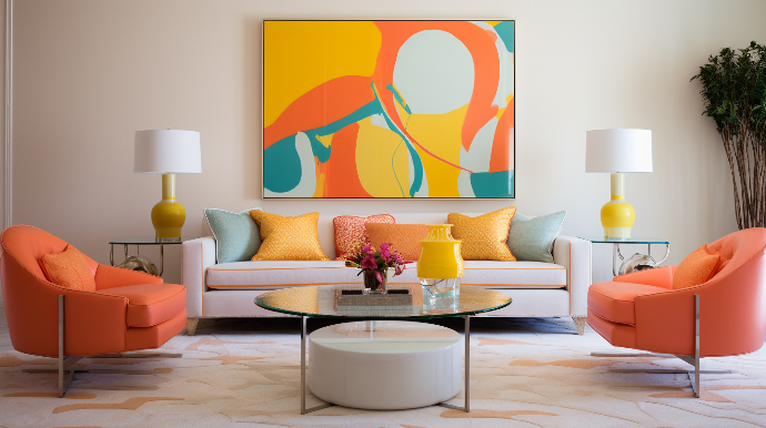
Designers often overlook the color wheel, a valuable tool for understanding color relationships. Complementary, analogous, or triadic color schemes can create harmony in a space when used correctly. Ignoring these principles can lead to discordant color combinations.
Inconsistent Themes:
When different design themes clash within the same space, it can result in confusion and a lack of cohesion. For example, combining a modern and traditional theme without proper consideration can create an unsightly juxtaposition.
Ignoring the Scale:
The scale of patterns is crucial. Using large patterns in a small room or vice versa can disrupt the visual balance. It's essential to choose patterns that suit the scale of the room.
Neglecting Personal Preferences:
While it's important to consider design principles, it's equally vital to consider the preferences and personality of the inhabitants. Ignoring personal tastes can result in a space that feels impersonal and uncomfortable.
Conclusion:
In the world of interior design, the importance of color and pattern coordination cannot be overstated. The careful selection and harmonious blending of colors and patterns are essential for creating spaces that are both visually pleasing and functional. By recognizing common errors and understanding the principles of coordination, designers can ensure that their projects result in interior spaces that are not only beautiful but also comfortable and inviting for those who inhabit them. Ultimately, a well-coordinated design can transform a house into a home and enhance the quality of life for its occupants.